

A landing page can attract plenty of clicks and still fail where it matters most – turning attention into action. For businesses investing in paid ads, SEO, email campaigns, or social traffic, that gap is expensive. If you are asking what makes a high converting landing page, the answer is not a single design trick. It is the result of clear positioning, focused user experience, technical performance, and alignment with a commercial goal.
Many businesses make the same mistake. They treat a landing page like a smaller homepage, add too many messages, and hope the visitor will figure out the next step. High conversion pages do the opposite. They reduce friction, guide decision-making, and make the intended action feel obvious and worthwhile.
What makes a high converting landing page in practice
A high converting landing page is built around one objective. That objective might be generating leads, booking consultations, collecting demo requests, driving purchases, or encouraging WhatsApp inquiries. Whatever the goal, every section on the page should support that single outcome.
This is where many campaigns lose efficiency. If an ad promises one thing and the landing page talks broadly about the company, the visitor has to work too hard to connect the dots. Conversion rates usually improve when there is a strong message match between the traffic source and the landing page itself. The headline, supporting copy, visuals, and call to action should all reinforce the same offer.
A page that converts well is rarely the page with the most content. It is usually the page with the clearest argument. Visitors should understand three things within seconds: what is being offered, who it is for, and why they should act now instead of later.
Clear value proposition comes first
The headline does the heavy lifting. It needs to communicate value quickly, not simply sound clever. Business audiences, especially decision-makers, respond better to clarity than wordplay. If the offer is a free consultation, quote request, software demo, promotional package, or service inquiry, say so directly.
Strong headlines are supported by concise subheadings that remove ambiguity. This is the place to mention business outcomes such as reducing operating friction, improving lead quality, increasing online visibility, or accelerating digital sales. The best copy is specific enough to feel credible but simple enough to scan.
Good landing page messaging also reflects visitor intent. Someone clicking a Google Ads campaign for web development services expects a page centered on web development, not a broad overview of every digital service available. Broader agency capabilities can still appear, but they should not distract from the immediate conversion path.
Relevance matters more than decoration
Design quality matters, but relevance matters more. A visually polished page that does not answer the visitor's need will still underperform. On the other hand, a cleaner and simpler page with tight message alignment often delivers stronger results.
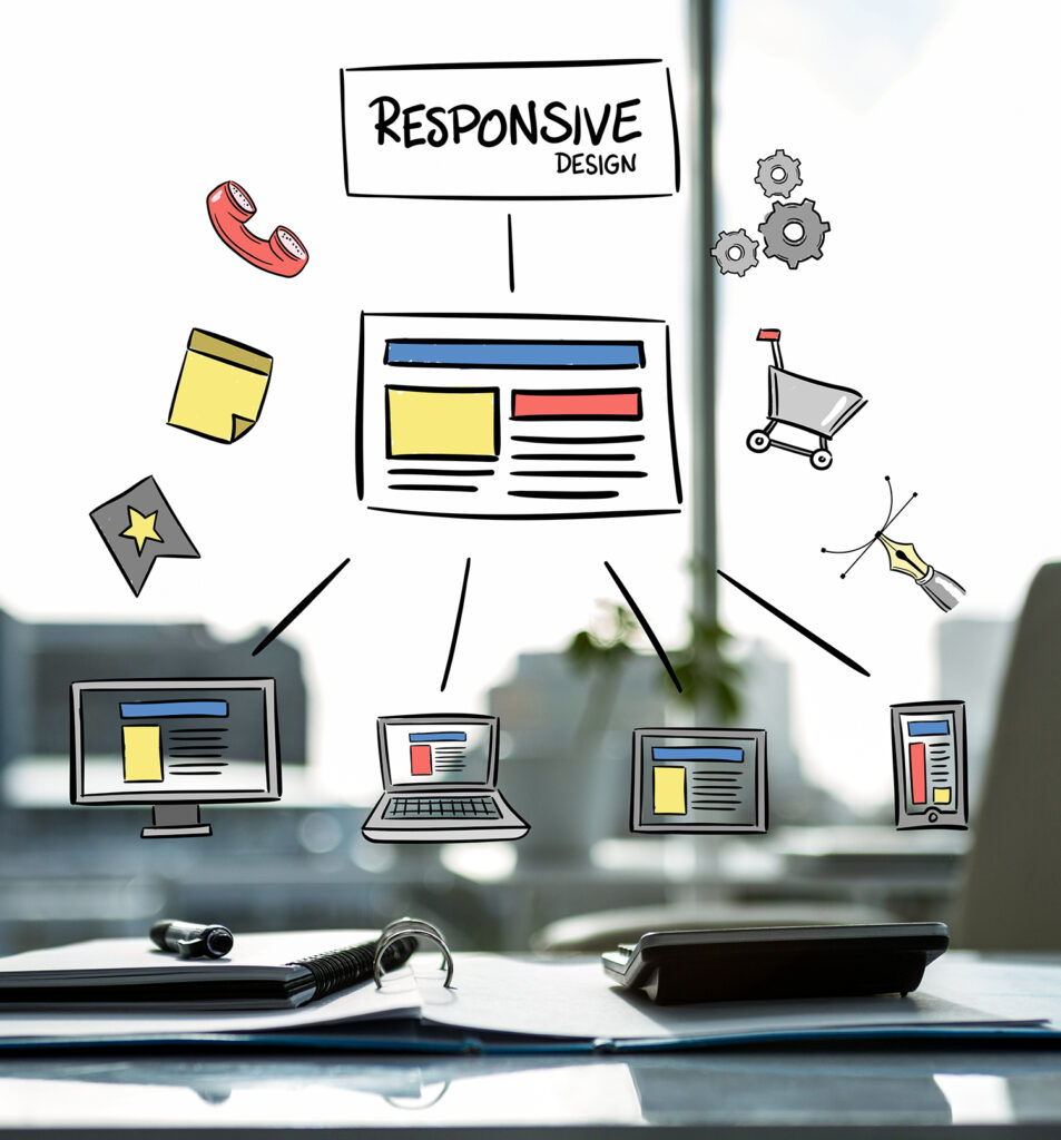
Images, icons, and layout should support comprehension. If visuals are generic, overly staged, or unrelated to the service, they add little value. For business-focused landing pages, relevant interface previews, service visuals, process indicators, or real project cues tend to perform better because they reinforce credibility.
This is also where audience targeting becomes visible. A startup founder, an SME owner, and a corporate marketing team may all need the same service category, but they do not always respond to the same framing. A high converting page reflects the priorities of the intended audience, whether that is speed to launch, lead generation, governance, scalability, or ongoing support.
Strong calls to action remove hesitation
Every high converting landing page has a clear primary call to action. Not three competing actions. Not a row of equal-priority buttons. One main next step.
The CTA should match the level of buyer readiness. If the offer is high commitment, asking for an immediate purchase may be unrealistic. A consultation request, audit booking, or proposal inquiry may be the better conversion goal. For lower-friction offers, a direct purchase or signup can work well.
The language matters too. "Submit" is weak because it says nothing about value. "Get a free proposal," "Book a consultation," or "Request pricing" gives the visitor a clearer reason to act. The difference may seem minor, but stronger CTA wording often improves completion rates because it reduces uncertainty.
Placement is just as important. The primary action should appear early, then reappear naturally as the page builds confidence. Visitors should not have to search for the next step once they are ready.
Trust signals do real conversion work
If a visitor is considering sharing business information, requesting a quote, or committing budget, trust becomes a deciding factor. This is especially true for service-based businesses, where the buyer is evaluating not just an offer, but the reliability of the provider.
Trust signals can include client logos, certifications, years of experience, project delivery volume, testimonials, industry specialization, security assurances, and process transparency. The key is relevance. A generic claim like "best service" carries little weight. A specific proof point such as serving established brands, supporting long-term maintenance, or delivering tailored development projects adds more substance.
Testimonials work best when they speak to results, responsiveness, or delivery quality rather than broad praise. Buyers want to know whether the provider can execute, communicate clearly, and support the project after launch.
Form design should protect conversions
A long or confusing form can damage an otherwise strong landing page. Every extra field creates friction. That does not mean every form should be short. It means the number of fields should match the value of the lead.
For a simple inquiry, asking only for name, company, contact details, and message may be enough. For a higher-value project lead, adding fields for budget range, timeline, or service interest can improve qualification. The trade-off is straightforward: shorter forms often increase volume, while slightly longer forms can improve lead quality.
Good form design also reduces hesitation. Clear labels, logical field order, visible privacy reassurance, and mobile-friendly input behavior all contribute to completion rates. If the form feels cumbersome on a phone, a large share of campaign traffic may never convert.
Speed and mobile performance are not optional
One of the most overlooked answers to what makes a high converting landing page is technical performance. If the page loads slowly, shifts during loading, or behaves poorly on mobile devices, conversion rates can drop even when the offer is strong.
Most business traffic now includes a substantial mobile segment, even for B2B campaigns. That means the mobile experience should be treated as a priority, not a reduced version of desktop design. Headlines should remain readable, forms should be easy to complete, buttons should be easy to tap, and content should stack cleanly.
Fast pages also support paid traffic efficiency. If you are paying for each click, every abandoned visit caused by poor performance increases acquisition cost. Technical optimization is not separate from conversion strategy. It is part of it.
Good landing pages answer objections before they are raised
Visitors rarely arrive with perfect confidence. They may wonder whether the service fits their business, whether pricing will be realistic, whether the provider understands their industry, or whether support continues after delivery.
High converting pages address these questions proactively. This can be done through short explanatory sections, process snapshots, FAQ content where useful, or well-placed trust elements. The goal is not to overload the page. The goal is to reduce the amount of unanswered doubt between interest and action.
This is also why specificity outperforms vagueness. If you offer tailored solutions, explain what that means in business terms. If your process includes strategy, development, and post-launch support, make that visible. A buyer should not need a sales call just to understand the basics of how engagement works.
Testing is what turns a decent page into a profitable one
Even well-built landing pages should not be treated as finished. Conversion performance depends on traffic source, audience temperature, offer strength, industry, device mix, and buying cycle length. What works for one campaign may underperform in another.
The most effective teams test continuously. They compare headline variations, CTA wording, form length, page structure, trust elements, and offer framing. Sometimes a small change lifts conversion rates significantly. Sometimes a change that looks better reduces performance. That is why assumptions should be tested against actual user behavior.
For businesses that want measurable outcomes, this matters. A landing page is not just a design asset. It is part of a revenue system. When strategy, design, development, and campaign thinking are aligned, the page becomes more than a digital brochure. It becomes a practical sales tool.
At SWOT, this is where integrated execution has a clear advantage. A landing page performs better when messaging, UX, technical build, and traffic strategy are developed with the same business objective in mind.
The strongest landing pages are not the most complex. They are the most deliberate. If every element on the page earns its place, the visitor has fewer reasons to hesitate and more reasons to act.