


A website that looks professional but fails to generate inquiries, sales, or booked calls is not doing its job. If you are asking how to improve website conversion rate, the answer usually has less to do with getting more traffic and more to do with removing friction, strengthening trust, and guiding visitors toward a clear business action.
For startups, SMEs, and established companies, conversion rate improvement is not a design trend or a marketing side task. It is a direct revenue issue. A site that converts better can reduce acquisition costs, improve return on ad spend, and help your marketing team produce stronger results without constantly increasing budget.
How to improve website conversion rate starts with intent
One of the most common problems on business websites is a mismatch between what the visitor wants and what the page is trying to say. A user clicks an ad, a search result, or a social post expecting one thing, then lands on a page that is too broad, too vague, or too focused on the company instead of the customer.
Conversion improves when intent is matched quickly. If the visitor is looking for a service, the page should explain the service clearly. If they want pricing guidance, process clarity, or a way to contact sales, those details should not be buried. Every important landing page should answer three questions within seconds: what you offer, who it is for, and what the next step should be.
This is where many businesses lose potential leads. They try to say too much at once. A page that targets everyone often persuades no one.
Clarify the primary action
Every key page needs one primary conversion goal. That could be a form submission, WhatsApp inquiry, phone call, quotation request, or checkout completion. Secondary actions are fine, but the main goal must be obvious.
If a page asks visitors to read the company profile, browse multiple services, subscribe to updates, and request a quote all at once, attention gets diluted. Strong conversion pages are focused. They reduce decision fatigue and make the next step feel simple.
Fix friction before chasing more traffic
Many business owners assume low conversions mean they need better campaigns. Sometimes that is true, but often the real issue is page friction. Visitors arrive with interest, then leave because the experience creates hesitation.
Friction appears in small ways. Slow loading times. Overly long forms. Weak mobile layouts. Hard-to-read text. Missing pricing context. Generic calls to action like “Submit” or “Learn More.” None of these problems seem dramatic on their own, but together they quietly reduce performance.
Speed and mobile usability matter more than most teams expect
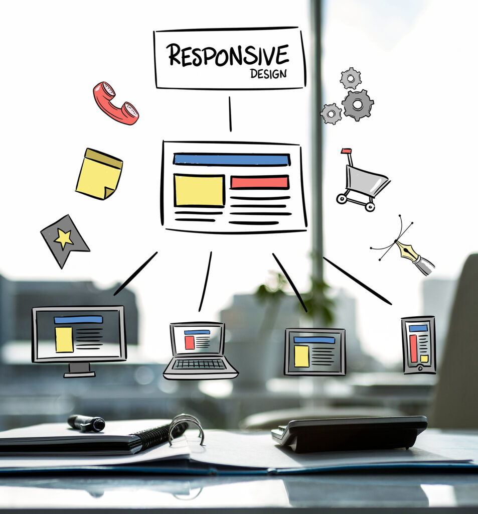
A fast website does not just support SEO. It affects conversions directly. If pages load slowly, users lose patience, especially on mobile connections. The same applies to poor responsive design. If buttons are hard to tap, forms are clumsy, or sections feel crowded on smaller screens, users abandon the process.
For many businesses in Malaysia and across regional markets, mobile traffic is no longer secondary. It is the main audience. That means conversion improvements should be reviewed on actual phones, not just desktop previews.
Reduce form resistance
Lead generation forms are often a major source of drop-off. Businesses ask for too much information too early, thinking more fields will improve lead quality. Sometimes that works, but often it does the opposite.
If your goal is to start a sales conversation, ask only for what your team truly needs. Name, contact detail, and inquiry type may be enough for an initial step. Additional qualification can happen later. The right form length depends on lead value, sales cycle, and audience intent, but shorter usually performs better when trust is still being established.
Trust is a conversion tool, not a branding extra
Visitors do not convert because a website says it is professional. They convert when the website gives them reasons to believe the business is credible, capable, and safe to engage.
Trust signals should be visible throughout the buying journey, not confined to an About page. This includes real project examples, client brands where appropriate, testimonials, business credentials, secure browsing, company contact information, and clear service explanations. In many industries, vague claims such as “high quality” and “best service” carry little value without proof.
Show evidence near the decision point
A common mistake is placing all trust-building content far away from forms or sales pages. Instead, put credibility elements close to conversion actions. A short testimonial beside a quotation form, a project result near a service CTA, or a concise statement about response times can reduce uncertainty at the exact moment a user is deciding.
This matters even more for higher-ticket services such as custom web development, digital marketing retainers, and cloud or infrastructure support. The more commercially significant the decision, the more reassurance a buyer needs.
Improve copy so visitors understand value faster
Design influences perception, but copy closes understanding. If website messaging is too generic, conversion rates suffer because users cannot quickly connect the offer to their business need.
Strong conversion copy is specific, commercially relevant, and easy to scan. It avoids inflated language and explains outcomes clearly. Instead of saying a company delivers innovative digital solutions, say what that means in business terms. More leads. Faster site performance. Better e-commerce usability. A simpler content management process. Reduced dependence on multiple vendors.
Write for decision-makers, not just browsers
Many business websites are written as if the audience has unlimited time. In reality, founders, marketing managers, and procurement stakeholders are scanning for confidence and fit. They want practical answers. What do you do? What results can this support? How does engagement work? Why should we trust you?
Calls to action should follow the same standard. “Request a proposal,” “Speak with our team,” or “Get a tailored quotation” is generally stronger than vague labels because it sets a clearer expectation.
How to improve website conversion rate with better page structure
Good structure helps people move forward without feeling pushed. That means using headings well, organizing content by relevance, and making sure each section supports the decision process.
A high-converting page usually starts with a clear value proposition, then moves into supporting details such as service scope, benefits, proof, process, and action. The exact order can vary. For example, a technical audience may want specifications early, while a general business audience may respond better to outcomes and proof first. This is one of those areas where it depends on your buyer profile.
Remove unnecessary exits
Not every page needs a full menu of options. On campaign landing pages especially, too many navigation choices can reduce conversion. If the page exists to generate leads for a specific offer, keep attention on that offer.
This does not mean hiding useful information. It means controlling distraction. A focused landing page often converts better than sending paid traffic to a general homepage.
Use data to improve, not to confirm assumptions
Conversion optimization works best when decisions are based on evidence. Heatmaps, scroll behavior, session recordings, form analytics, and page-level conversion tracking can reveal where users hesitate or drop off.
Businesses often redesign pages based on internal opinions rather than user behavior. That is expensive and unreliable. A better approach is to identify one problem at a time, test improvements, and measure whether conversion rate, lead quality, or completion rate actually increases.
Prioritize high-impact pages first
Start with pages that influence revenue directly. Service landing pages, quote request pages, product pages, and key campaign destinations should be reviewed before lower-priority content. This keeps optimization tied to commercial outcomes.
At SWOT, this is often where integrated execution becomes valuable. Design, development, copy, tracking, and campaign alignment all affect conversion. Treating them separately can slow progress and create conflicting decisions.
Align traffic source and landing page experience
A conversion problem is not always on the page itself. Sometimes the issue starts before the visit. If ad messaging promises one thing and the landing page presents another, users lose confidence. The same happens when SEO content attracts broad informational traffic to a page built for direct sales.
Your traffic source, audience targeting, and landing page message should match. Someone clicking a Google Ads campaign for web design services should land on a page specifically built around web design needs, proof, and inquiry flow. Sending that visitor to a generic corporate homepage usually weakens performance.
Test what matters, not cosmetic changes
A/B testing can help, but only when the test addresses real friction. Changing button colors may produce small gains, yet larger improvements usually come from stronger messaging, clearer offers, simpler forms, better trust placement, and faster page performance.
The key is to test meaningful variables. Offer framing, CTA wording, page layout, lead form length, proof positioning, and mobile usability often deliver stronger results than minor visual changes. Still, not every website has enough traffic volume for formal split testing. In those cases, measured iterative improvements are a better fit than forcing a testing process that cannot reach valid conclusions.
A better conversion rate rarely comes from one dramatic fix. It usually comes from making the website easier to trust, easier to understand, and easier to act on. When that work is done properly, more of your existing traffic turns into real business opportunities, and your website starts functioning as an asset rather than a brochure.