

A website can look polished, load on time, and still fail to produce inquiries, sales, or qualified leads. That gap is usually where businesses start asking what makes a website convert better – and the answer is rarely just design. Higher conversion comes from how well the site aligns business goals, user intent, trust signals, and the path to action.
For business owners and marketing teams, this matters because traffic alone does not create revenue. If visitors arrive but do not contact you, request a quote, book a demo, or complete a purchase, the website is underperforming as a business asset. A better-converting website is one that removes friction, builds confidence, and guides the right visitor toward the next commercial step.
What makes a website convert better in real business terms
Conversion is not only about getting more clicks on a button. It is about getting the right action from the right audience. For one company, that may mean lead form submissions. For another, it may be direct online purchases, WhatsApp inquiries, brochure downloads, or appointment bookings.
That is why conversion strategy should begin with business objectives, not visual trends. A corporate services firm may need credibility and lead qualification. An e-commerce brand may need stronger product presentation and fewer checkout drop-offs. A startup may need to explain a new offer quickly before asking for commitment. The website structure, copy, and functionality should reflect that commercial reality.
A common mistake is trying to make the homepage do everything for everyone. When messaging becomes too broad, users do not see themselves in the offer. Websites convert better when each major page has a clear purpose, a defined audience, and one primary action.
Clear messaging usually matters more than clever design
Visitors decide quickly whether your website is relevant to them. If the headline is vague, the offer is buried, or the language is too generic, attention drops fast. Businesses often invest heavily in layout and visuals while underestimating the role of clear copy.
Strong conversion-focused messaging answers basic commercial questions immediately. What do you offer? Who is it for? Why should a buyer trust you? What should they do next? If a visitor has to interpret these answers on their own, conversion rates typically suffer.
The strongest websites are direct. They state the value proposition in practical language, not abstract brand phrases. They show outcomes, not just features. They explain why the service matters and how engagement works. This is particularly important for SMEs and B2B companies, where buying decisions often involve risk, budget approval, and comparison against competitors.
There is a trade-off here. Short copy can feel modern, but if it removes needed context, users hesitate. Long copy can improve clarity, but if it is poorly structured, people stop reading. The better approach is not simply more or less content. It is the right content in the right place.
User experience is conversion strategy, not a design extra
A website that is difficult to use will underperform no matter how strong the offer is. Navigation, page hierarchy, mobile responsiveness, form usability, and page speed all affect whether people continue or leave.
User experience matters because most visitors are not studying your site in detail. They are scanning for relevance and trying to complete a task with minimal effort. If menus are confusing, buttons are inconsistent, or key information is hidden, the path to conversion becomes weaker.
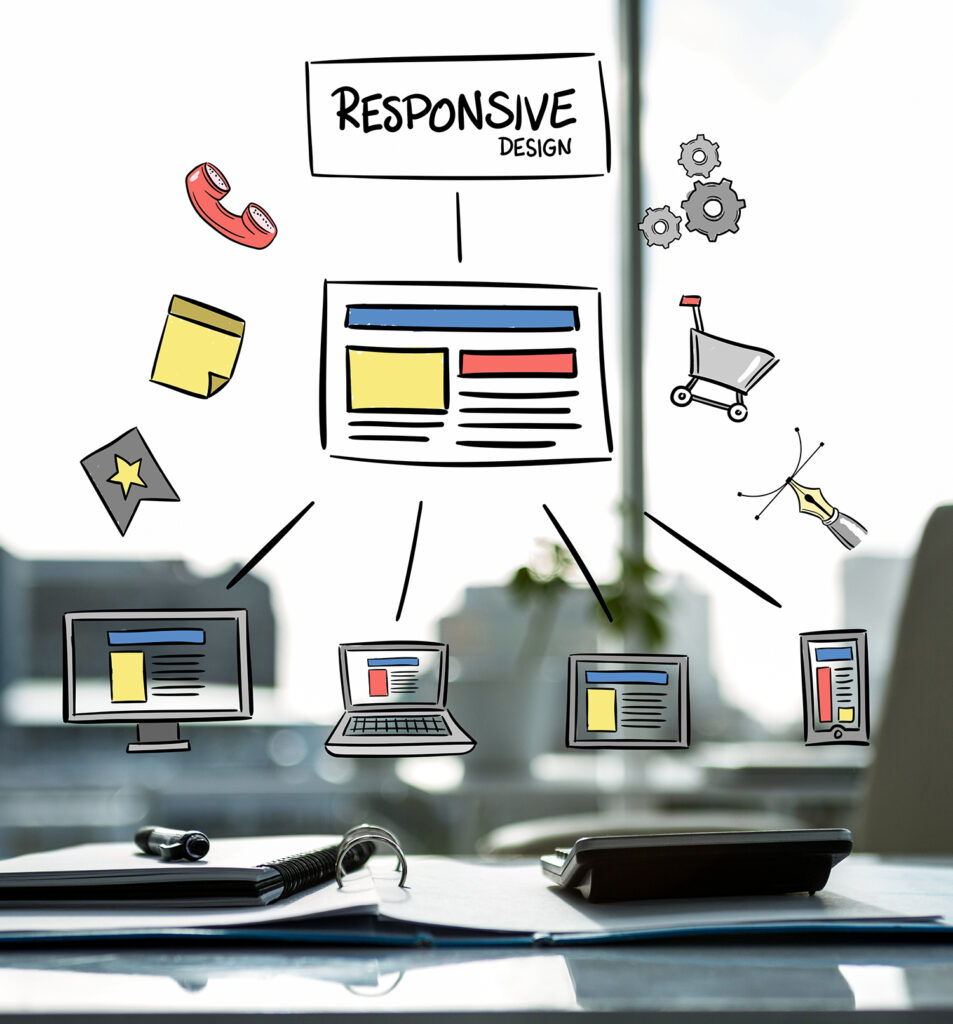
Mobile experience deserves special attention. In many markets, mobile traffic is dominant, yet many business websites still treat mobile as a compressed desktop version. A conversion-focused mobile experience needs readable content, thumb-friendly buttons, short forms, fast load times, and clear access to contact options.
This is where businesses should avoid assuming that more features create more value. Extra animations, oversized media, pop-ups, and too many content blocks can make a site feel busy rather than effective. What makes a website convert better is often restraint. The user should always know where they are, what the business offers, and what action to take next.
Trust signals reduce hesitation
Most visitors do not convert because they are not yet convinced. They may be interested, but interest is not the same as confidence. Trust is what moves a prospect from browsing to action.
Trust signals can include client logos, testimonials, case studies, certifications, awards, secure browsing, company information, clear policies, and consistent branding. In service businesses, real proof matters more than polished claims. If you say you deliver measurable results, the website should support that with examples, outcomes, or recognizable indicators of reliability.
For newer businesses, the challenge is different. You may not yet have a long portfolio or major-brand clients. In that case, trust can still be built through clarity, professionalism, transparent process, strong service presentation, and responsive contact options. Buyers are often evaluating whether the company feels credible and dependable, not just whether it is the biggest player in the market.
Poor trust presentation can quietly damage performance. Missing business details, weak copy, outdated visuals, broken pages, and inconsistent branding all create doubt. These may seem like minor issues internally, but to a prospect seeing the company for the first time, they can be enough to stop conversion.
Better conversion depends on the right calls to action
Many websites ask for action too early, too vaguely, or too often. A button that says Contact Us is not always enough, especially if the user still has questions about pricing, fit, process, or expected outcomes.
Good calls to action match the visitor's level of intent. A high-intent user may be ready to request a quote or place an order. A lower-intent visitor may prefer to ask a question, view a portfolio, compare packages, or start on WhatsApp. Websites convert better when they provide practical next steps rather than forcing every user into the same commitment level.
Placement also matters. If the only contact prompt appears at the bottom of a long page, many users will not reach it. If every section pushes a hard sell, the site can feel aggressive. Effective websites create a natural rhythm. They present value, answer objections, and then invite action at logical points.
The form itself should also be treated as part of conversion strategy. Long forms may help qualify leads, but they can reduce inquiry volume. Short forms increase convenience, but sometimes attract low-quality submissions. The right balance depends on the sales process and the value of each lead.
Speed, technical quality, and consistency affect results
Businesses sometimes separate technical performance from conversion performance, but users do not. If a page loads slowly, breaks on mobile, or behaves inconsistently across devices, trust and engagement drop immediately.
Technical quality supports conversion in practical ways. Fast-loading pages reduce abandonment. Stable layouts keep users focused. Clean development improves usability. Search visibility can improve when the technical foundation is sound, which means more qualified traffic reaches the site in the first place.
Consistency across pages is equally important. When service pages, product pages, and landing pages all follow different design logic or messaging standards, the brand feels fragmented. A business website should feel like one system, not a collection of disconnected pages built over time.
This is one reason many companies benefit from working with a single digital partner that understands design, development, performance, and ongoing support together. SWOT approaches websites this way because conversion is rarely solved by one isolated fix. It improves when strategy, user experience, content, infrastructure, and post-launch refinement are aligned.
Measurement is what turns a good website into a better one
No website gets everything right on the first launch. Market behavior changes, traffic sources shift, and users respond differently than expected. Businesses that improve conversion consistently are the ones that measure real user behavior and make informed adjustments.
That means tracking where inquiries come from, which pages hold attention, where users drop off, which devices perform best, and which forms or calls to action produce qualified outcomes. Without this visibility, website decisions become guesswork.
It also helps to separate vanity metrics from commercial metrics. More traffic, more page views, and lower bounce rate may sound positive, but they do not always lead to more sales or better leads. Conversion improvement should be tied to business value. A site that generates fewer but more qualified inquiries may outperform one that produces many weak leads.
What businesses should focus on first
If a website is not converting well, the first priority is usually not a full rebuild. It is identifying the main bottleneck. In some cases, the issue is unclear positioning. In others, it is weak trust, poor mobile usability, slow performance, or low-quality traffic.
The most effective path is to review the website as a commercial journey. Are the right visitors landing on the right pages? Is the offer immediately clear? Does the site feel credible? Is the next step obvious and easy? Are forms, calls, and messaging aligned with how buyers actually decide?
When those fundamentals are in place, design becomes more valuable, marketing performs better, and the website starts doing what it should have been doing all along – supporting growth, not just representing the brand.
A better-converting website is not the one with the most effects or the most pages. It is the one that makes decision-making easier for the customer and revenue generation more reliable for the business.